
The Hidden Psychology of Color Palettes in High-Stakes Corporate Negotiation Room Design
Walk into any room where a nine-figure merger is about to be decided, and you’ll notice something odd: nobody in that room chose the wall color by accident. The carpet, the conference table finish, and the accent wall behind the CEO’s chair are all decisions made, consciously or not, to shape how people think, feel, and ultimately concede.
Color is not decoration in a negotiation room. It’s a lever.
Why Color Gets to the Brain Before Language Does
Language is processed. Color is felt, and it’s felt fast. The visual cortex registers hue and saturation in milliseconds, well before the prefrontal cortex has assembled a coherent thought about the room. That means the emotional tone of a negotiation is often set before a single word is spoken, simply by what the walls are doing.
This is why so many negotiation psychologists talk about color not as an aesthetic choice but as a pre-verbal cue. It primes arousal levels, trust, dominance perception, and even risk tolerance, all of which directly affect how people bargain.
Why Color Gets to the Brain Before Language Does
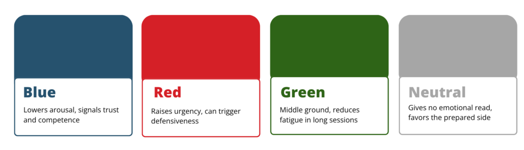
Blue: The Trust Engine
Blue consistently tests as the color most associated with reliability, competence, and calm. It’s why so many banks, law firms, and Fortune 500 boardrooms default to navy and slate tones. In negotiation settings, blue tends to lower physiological arousal (slower heart rate, more measured speech), which is exactly what you want when you need the other side to slow down and think rather than react.
The catch: too much blue can read as cold or corporate-detached, which is a liability if the deal depends on relationship-building rather than pure logic.
Red: The Pressure Cooker
Red raises heart rate and blood pressure measurably, and it heightens perceived urgency. Some negotiators use it deliberately: a red accent wall, red folder covers, even red lighting during the final push, all to compress the sense of available time and provoke faster, more instinctive decisions. It’s the same mechanism retailers use with “sale” signage, just weaponized for boardrooms.
The risk is real, though: red also spikes perceived aggression and can trigger defensiveness rather than compliance, especially in cultures where red carries confrontational connotations.
Green: The Compromise Color
Green sits in an interesting psychological middle ground, associated with growth, stability, and “go” signals, but without red’s aggression or blue’s coldness. Rooms designed for long, multi-session negotiations (labor disputes, joint ventures) often lean toward muted greens because they reduce visual fatigue over hours of sitting and staring at the same walls.
Neutral Grays and Beiges: The Blank Canvas Strategy
Increasingly, the most sophisticated rooms use almost no color at all. Neutral palettes are a power move in their own right: they refuse to give the other party any emotional read on the room, forcing them to project their own state onto a blank environment. Some negotiation consultants argue this ambiguity actually favors whoever is more prepared, since the room offers no emotional shortcuts to either side.
The Power Move Nobody Talks About: Asymmetric Lighting-Color Interaction
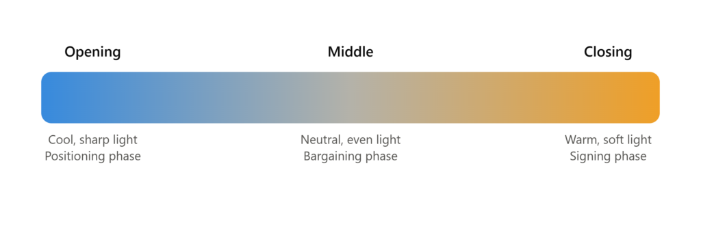
Here’s where it gets genuinely clever. Color doesn’t operate in isolation; it interacts with lighting temperature, and top negotiation-room designers exploit this pairing. A warm-white light over a cool-blue palette creates subtle visual tension that reads, subconsciously, as unresolved. That’s useful when you want the other side to feel the deal isn’t done and shouldn’t be treated as settled. Conversely, warm light over warm neutrals (taupe, warm gray, soft amber) creates a sense of resolution and closure, often introduced deliberately in the final fifteen minutes of a negotiation to cue the room that it’s time to sign.
Some corporate real estate teams now install tunable LED systems specifically so the lighting-color relationship can shift over the course of a single meeting: cooler and sharper during the opening positioning phase, warmer and softer as the room moves toward agreement.
Status Signaling Through Saturation, Not Just Hue
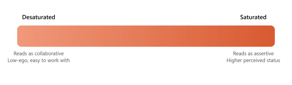
There’s a subtler variable most people miss entirely: saturation. Highly saturated colors, like vivid reds and electric blues, read as more assertive and higher-status. Desaturated, muted versions of the same hues read as more collaborative and lower-ego.
This is why the party trying to project dominance in a negotiation often unconsciously (or very consciously) selects a room with saturated branding, think a bold corporate red logo wall, while the party trying to appear cooperative and easy to work with will steer toward a muted, desaturated version of their brand palette for the meeting space.
The Home-Field Color Advantage
There’s also a strategic layer around whose palette the room reflects. When a negotiation happens on one company’s home turf, that company’s brand colors are usually already baked into the walls, the coffee cups, even the branded notepads on the table. This isn’t vanity; it’s territorial psychology. Humans register environments coded in “someone else’s colors” as subtly less neutral, which can prime a visiting negotiator toward slightly more deferential behavior without ever realizing why.
Sophisticated negotiation teams increasingly ask for neutral third-party venues specifically to strip this advantage away, a small, easy-to-overlook clause in deal logistics that can meaningfully rebalance psychological footing before anyone sits down.

Beyond Paint: Why Acoustics Shapes Negotiation as Much as Color
Color gets the attention, but it’s only half the sensory environment.
Sound behaves the same way psychologically: a hard-surfaced room with poor sound absorption keeps everyone’s nervous system slightly elevated, because untreated echo and ambient noise read, at a subconscious level, as a lack of control over the space. A well-treated room does for the ear what a calm palette does for the eye.
This is where acoustic material choice becomes a negotiation-design decision, not just a comfort one.
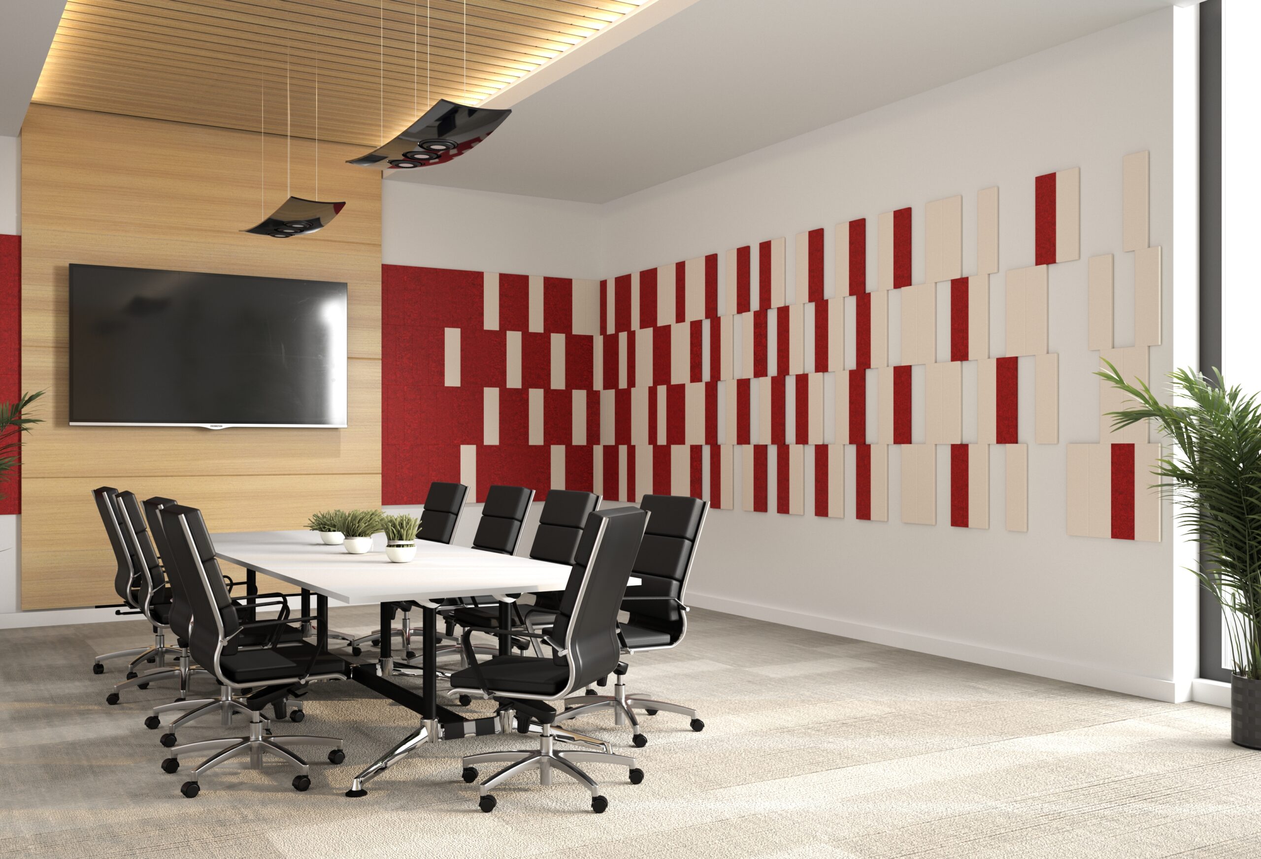
Rooms fitted with sound-absorbing surfaces, such as acoustic wall panels, ceiling clouds, or fabric-wrapped tiles, measurably reduce reverberation time, which lowers perceived tension and makes lower, more measured speech easier to sustain through a long session.
Boardrooms built for high-stakes, multi-hour negotiations increasingly pair a considered color strategy with acoustic treatment for exactly this reason: the two systems reinforce each other. A cool, trust-signaling blue wall does less work in a room where every word echoes.
The Ethical Question Nobody Wants to Ask
Once you understand that a paint chip can measurably shift cortisol levels and decision speed, an uncomfortable question follows: is manipulating the color environment of a negotiation room a legitimate strategic tool, or a form of covert influence that undermines informed consent in the deal itself?
There’s no clean answer. Framing, tone of voice, and even where people sit are also “manipulative” in the same technical sense, and nobody considers those unethical.
Color sits on that same spectrum: a tool that’s only as ethical as the intent behind it and the transparency of the process it’s embedded in.
The Takeaway
The next time you walk into a negotiation and the room feels a little too calm, a little too urgent, or strangely hard to read, pay attention. It’s very possible someone spent real time and money engineering exactly that feeling into the walls before you arrived.
The best negotiators aren’t just reading the person across the table. They’re reading the room itself, and increasingly, they’re the ones who built it.
Ready to Design?
Explore Workspace48’s collection of workstations, seating, storage, and collaborative solutions and discover how the right workplace design can create lasting impact.
Contact us!
References
Mehta, R., & Zhu, R. (2009). Blue or red? Exploring the effect of color on cognitive task performances. Science, 323(5918), 1226 to 1229. https://www.science.org/doi/abs/10.1126/science.1169144
Elliot, A. J., & Maier, M. A. (2014). Color and psychological functioning: A review of theoretical and empirical work. Frontiers in Psychology. https://pmc.ncbi.nlm.nih.gov/articles/PMC4383146/
Valdez, P., & Mehrabian, A. (1994). Effects of color on emotions, cited in research showing saturation correlates positively with perceived dominance. Journal of Experimental Psychology: General. https://www.frontiersin.org/journals/psychology/articles/10.3389/fpsyg.2025.1593928/full
Chen, N., Yang, Y., Kobayashi, M., Nakamura, K., & Watanabe, K. (2024). Red backgrounds enhance dominance in human faces and shapes. i-Perception. https://dx.doi.org/10.1177/14747049241284602
Wang, et al. The color of status: Color saturation, brand heritage, and perceived status of luxury brands. Journal of Consumer Research. https://academic.oup.com/jcr/article/52/6/1232/8120421
Jahncke, H., Hygge, S., Halin, N., Green, A. M., & Dimberg, K. (2011). Open-plan office noise: Cognitive performance and restoration. Journal of Environmental Psychology. https://www.sciencedirect.com/science/article/abs/pii/S0272494411000429
Kosova, R. Coloring trust: Insights and research perspectives. New Psychological Research. https://journals.rcsi.science/2782-2184/article/view/298120
The Master Negotiator & Body Language Group. Master color psychology: How to easily win more negotiations. https://www.themasternegotiator.com/master-color-psychology-how-to-easily-win-more-negotiations/
Color Institute. The power of color psychology in business and leadership. https://colorinstitute.com/the-power-of-color-psychology-in-business-and-leadership/
Note: color psychology findings are context-dependent and some effects are debated in the literature; the sources above represent a mix of peer-reviewed research and practitioner analysis.